
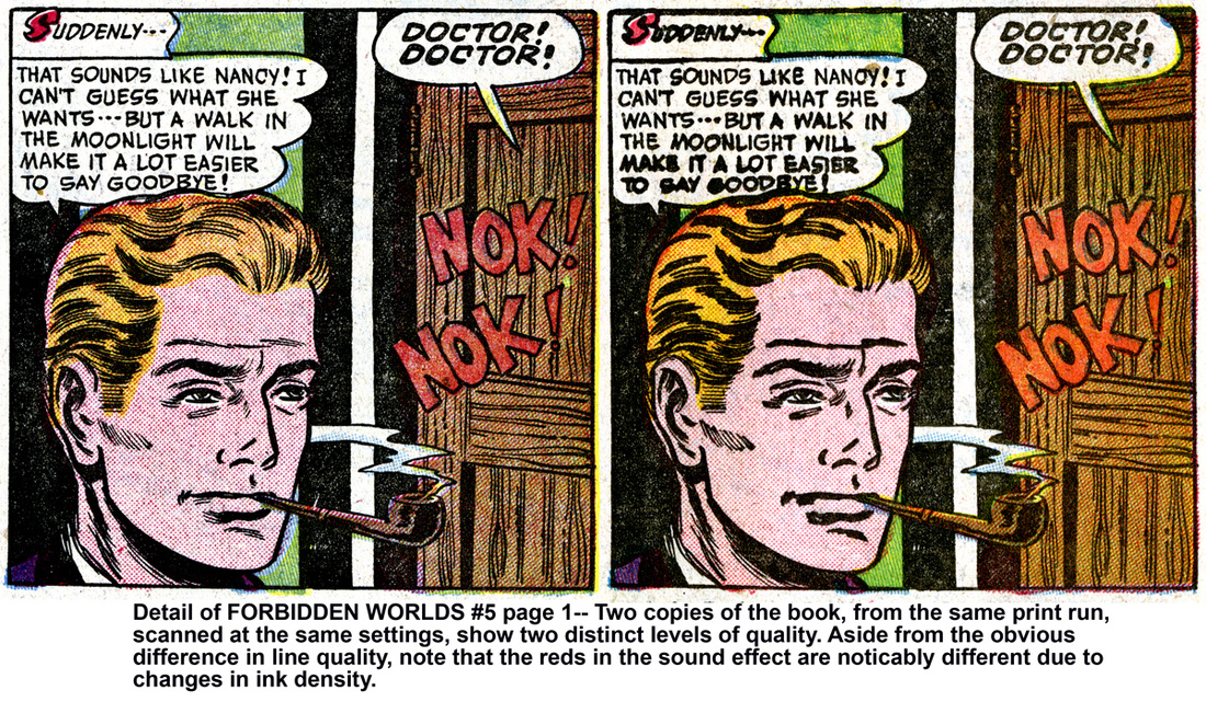
Of the hundreds of thousands ( if not MILLIONS ) of people who purchased a newspaper on May 20, 1906 and saw the popular 'Little Nemo' comic strip, very few of them saw the same thing.
Sure, the basic illustration was the same, and the story was the same, but quality of the printing dictated the look and feel of the art, and printing in the early 20th century was primitive.
The still maturing reproduction methods that gave us the first full color printed comic-strips rarely gave readers an accurate representation of the truly beautiful work of the early masters like Winsor McCay.
Line art would become thick, blending fine details together into an unintelligible mass.
Conversely, thin lines would break apart or disappear completely.
Colors, using the ‘Ben Day’ process ( those tiny dots of color ), would also suffer from the same problems… too thick, too thin, too dark, too light, not enough ink, too much ink, etc… And, of course, the ever-present problem of ’misregistration’ ( when one or more colors do not fall within the black lines ).
To make matters worse, there was no single company that printed all of the comic strips. Each newspaper publishers would receive a copy of the artwork and color separations, then print the comics themselves.
Every publisher would have different problems evident in their print runs. Three ‘Little Nemo’ strips, printed on the same day at three different locations would all look different… The colors would be too light on one, too dark on another, and the line art thickness would vary from publisher to publisher.
On top of that, a single print run from a single publisher would show vast differences between the first printed sheets and the last printed sheet. Plates would wear out and the image would slowly deteriorate with each pass on the press.
Oh, and there were no strictly followed standards for ink colors at the time, so even the shades of red and blue would vary depending on what city you bought you newspaper. One paper could have blues that all lean towards purple and others can have reds that appear to be orange.
Fast forward 100 years…
We have seen a wonderful resurgence of interest in old comic art.
Hundreds, or maybe even thousands, of volumes have been released since the new millennium, re-presenting material that hasn’t been in print for decades.
Publishers, both large and small, have been offering beautiful collections of previously-released material. These volumes serve to re-introduce important and/ or classic stories and characters to a new, modern audience. Sadly, due to many factors, the majority of the old material is reprinted by simply scanning copies of old comics or comics strips, then reprinted with imperfections and all.
Not only does this not give the highest quality, but more importantly, it’s not what the artist intended for you to see.
Even the gorgeous collections of original art being published today are not what the original artists expected you to look at.
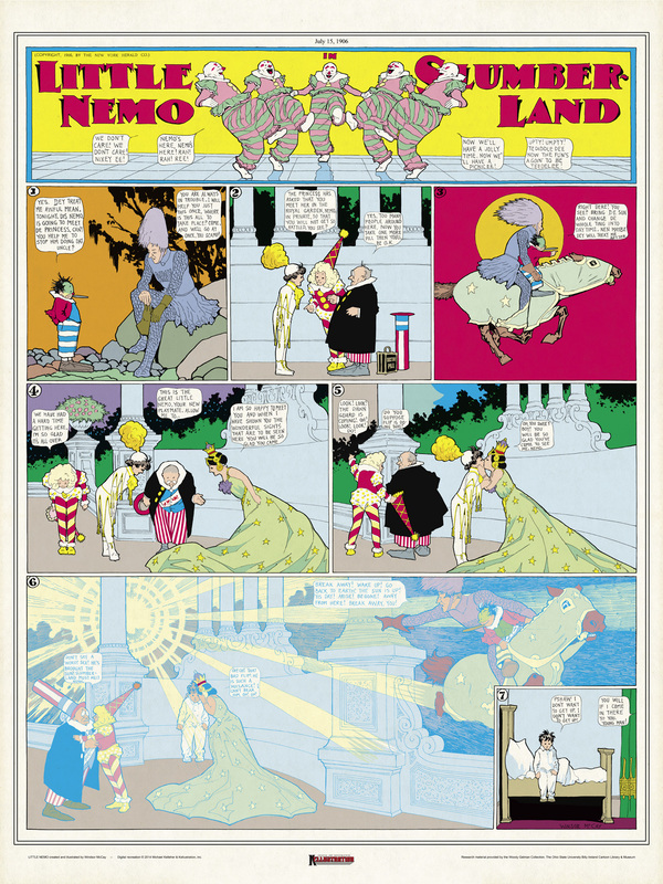
Our goal is to try and show you what we believe was the original intent of the artists… what the artists wanted you to see, and what you would have seen if the printing process was better 100 years ago.
For over ten years we have been researching and studying the processes used by the artists, the color separators, and the printing process itself.
Using that information, we have restored each piece in ‘The Masters Series’ to show the world how beautiful this work really was.
With each print we concentrate on restoring the artwork, including the colors, to specifications and expectations that were standard at the time of the original printing. We consider the limitations of the printing process and factor that into our color interpretation. For instance… the printing process 100 years ago was not good enough to give a full 100% ink coverage ( meaning; if they tried printing a big, solid square of red, which today we would call 100% coverage, the limitations of the printing process at the time would have made the red square look more like 80-90%… or, simply put, a slightly lighter version of red ), so we researched what was considered optimal at the time, and we have reduced our 100% coverage down to that number.
We have seen a wonderful resurgence of interest in old comic art.
Hundreds, or maybe even thousands, of volumes have been released since the new millennium, re-presenting material that hasn’t been in print for decades.
Publishers, both large and small, have been offering beautiful collections of previously-released material. These volumes serve to re-introduce important and/ or classic stories and characters to a new, modern audience. Sadly, due to many factors, the majority of the old material is reprinted by simply scanning copies of old comics or comics strips, then reprinted with imperfections and all.
Not only does this not give the highest quality, but more importantly, it’s not what the artist intended for you to see.
Even the gorgeous collections of original art being published today are not what the original artists expected you to look at.
Our goal is to try and show you what we believe was the original intent of the artists… what the artists wanted you to see, and what you would have seen if the printing process was better 100 years ago.
For over ten years we have been researching and studying the processes used by the artists, the color separators, and the printing process itself.
Using that information, we have restored each piece in ‘The Masters Series’ to show the world how beautiful this work really was.
With each print we concentrate on restoring the artwork, including the colors, to specifications and expectations that were standard at the time of the original printing. We consider the limitations of the printing process and factor that into our color interpretation. For instance… the printing process 100 years ago was not good enough to give a full 100% ink coverage ( meaning; if they tried printing a big, solid square of red, which today we would call 100% coverage, the limitations of the printing process at the time would have made the red square look more like 80-90%… or, simply put, a slightly lighter version of red ), so we researched what was considered optimal at the time, and we have reduced our 100% coverage down to that number.
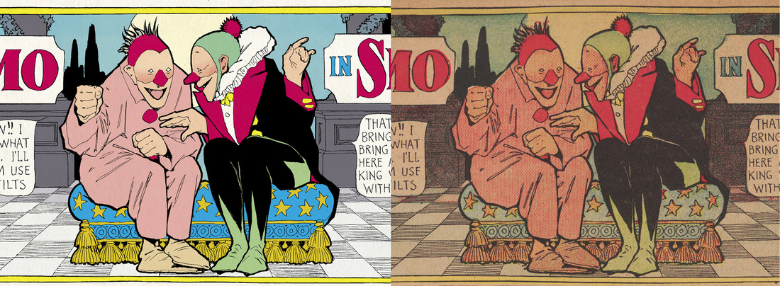
We work on the assumption that a brilliant artist like Winsor McCay noticed the limitations of the printing process and adjusted his work accordingly. After all, McCay was experimenting with and pushing the process of print-art production itself, so it stands to reason to think that he knew his reds would never print at 100%.
It is that attention to detail and knowledge of the process that sets our restorations apart from other restorations.
It is important to note that at this point, we are not looking to restore entire runs or series. Would we love to restore every 'Little Nemo' strip ever created....? Of course, but we realize that it is not feasible ( at present time, at least ). We are concentrating on individual pieces where we can obtain high quality scans of original art to work from. As one of the largest suppliers of comic art restoration in the world, we understand, respect and, quite frankly, LOVE the occasional task of restoring a piece of art using only printed material as our guide, but that is not what we want to do here.
Our goal is simple… we want to show you the pure beauty, brilliance and genius of the artists that created and perfected the medium of sequential art. We will do that by concentrating on individual pieces, and not entire volumes.
With the help of the Billy Ireland Museum, we are starting with one of my personal favorites, ‘Little Nemo in Slumberland’, but Nemo is not the main focus of our series. We are working with collectors and licensers to bring a wide variety titles and artists.
Our current release schedule will bring you two Little Nemo prints in January 2015, followed by two new prints every other month.
Each print will be presented at the same size as the original comic strips and printed on 18 x 24 inch, slightly off-white stock which emulates the color of fresh newsprint, adding to the authentic feel of the original printings yet providing a quality print suitable for framing.
We’ll also be posting ‘liner notes’ for each print here on our blog. We’ll give you some insight into how we work as well as show you some of the things we find to be cool and interesting.
If you are a comic art fan, we think you’re going to enjoy these!
 RSS Feed